The California-based graphic designer on Star Trek, minimalist aesthetics and why you need to do what you love.

There are two rules to designing a movie poster every day for a year, explains US graphic designer Scott Saslow.
Rule one – only do posters for movies you’ve seen
Rule two – use free imagery only
With this framework in place Saslow set to work last year, challenging himself to create 365 posters that encapsulate the character and creative expression of the chosen films. No mean feat.
“I read about a designer in Australia, Pete Majarich, who was doing one movie poster a day. All very minimalist. Some used only text, others used simple vector graphics,” Saslow explains. “His photos were mostly free public domain imagery. The proverbial light bulb went off over my head: ‘Why not me?!’ So I did it.”
The subject matter was rich and varied, from Hitchcock masterpieces like Psycho and Vertigo to 80s classic Heathers and Charlie Kaufman’s latest offbeat offering, Anomalisa. He completed the project earlier this year.
“There wasn’t really a structure, per se. Sometimes I’d see a cool photo and think ‘wow, I can use that for…’ Other times, I’d go through my movie collection and get an idea,” Saslow explains.
“If I was stumped, I’d simply use a good still from a film. As long as I had something to upload by midnight. There are still plenty of movies, including several personal favourites, for which I have no ideas whatsoever! What can I possibly do for Star Wars or The Shining that hasn’t been done yet? But it’s something that’s always on the brain.”
Instead of wasting time wracking his brain for hours on end Saslow found it best to think his way through the problem, choosing a photo and getting to work. This strategy reflects his minimalist style and ambition to sum up a narrative with a single photo, shape or typeface.

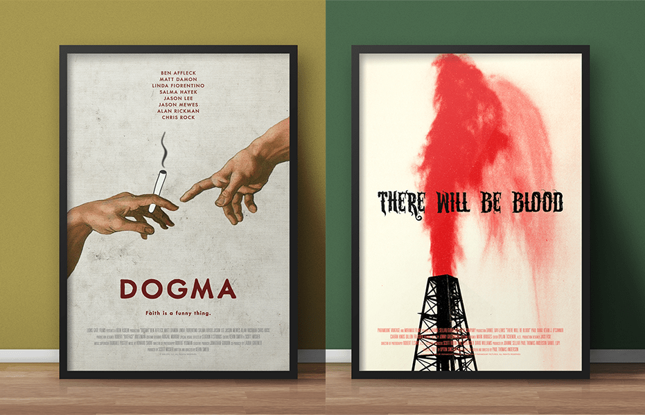
“I do want to stress that they’re not all gold, but I’m happy with a good one-sixth of them. Dogma will always hold a special place for me. It’s the one poster that got the most attention, thanks to some social media love from [Dogma director and screenwriter] Kevin Smith. I even got a couple of paid gigs thanks to all the attention.
“I also love the symmetry of The Imitation Game and Dead Ringers, the bold colour of There Will Be Blood, the dark humour of Heathers, the paranoia of High Rise, and Brazil… well, that’s just a big inside joke. If you know about that film’s controversial history, you’ll get it.”
From a conceptual point of view Seven Days in May and Fail-Safe are favourites in their ability to say so much with so little, Saslow explains.
“I must say I’m also fond of my Spies Like Us poster where I attempted to visualise a purely verbal joke. And Capricorn One, a movie probably best known today for co-starring O.J. Simpson, is about a fake NASA landing on Mars. I must say I think my solution was rather eloquent.”

Design influences
The next couple of months remain busy for Saslow who, alongside various commissions to design movie posters for filmmakers in his local LA, is set to feature in a Stanley Kubrick-themed art show at collectables store Creature Features in Burbank, California.
This follows hot on the heels from his first book signing as one of the artists featured in Printed in Blood’s The Thing art book celebrating the 35th anniversary of John Carpenter’s cult classic, and a high profile commission to design a film noir boxset for UK horror and cult film distributor Arrow Video.

Looking back, Saslow’s love of graphics and signage started early as a nine-year-old Star Trek fan admiring the work of American graphic artist Michael Okuda and the show’s art department.
“I received a book, The Making of Star Trek: Deep Space Nine by Judith and Garfield Reeves-Stevens, as a gift and was just floored by the idea that people could get paid for that kind of work. So I think that might’ve planted the seed in my head: getting paid for doing something creative that people might notice,” Saslow recalls.
After initially exploring a career in film production, Saslow went on to study graphic design in Florida, developing a pop culture style that naturally combined his twin loves of design and film.
“I find it difficult sometimes to separate good posters from posters for films I happen to love. The Ghostbusters logo is iconic, but is the poster my favourite?” Saslow considers.
“Thinking about it, I do love John Berkey’s Star Wars posters and Bob Peak’s Superman posters. I’m grateful I grew up at the tail end of an era when posters were still painted.”
Saslow credits Sam Smith and Brandon Schaefer, graphic artists and co-hosts of The Poster Boys podcast, as the two people responsible for the ‘a-ha!’ moment that helped him realise he could bring his love of movie posters to life.

Saslow’s creative influences spread far and wide, including LA-based graphic designer Midnight Marauder, movie poster designer Neil Kellerhouse, designer and critic Michael Bierut, Dutch designer Lex Reitsma, Portland-based graphic designer Aaron Draplin and Peter Mendelsund.
“Mendelsund is a book cover designer and his story was especially inspirational. Like me, he originally started in another field altogether – he was a classical pianist who later taught himself graphic design,” says Saslow.
“As far as historical influences, I love Saul Bass, Alex Steinweiss, Massimo Vignelli, Armin Hofmann, and Josef Müller-Brockmann. I’m a big fan of the Swiss Style and Constructivism. And I still have a lot of learning to do.”

Leave a comment